- Increase the percentage of site visitors who configure their vehicle information
- Reduce form complexity by limiting the number of fields visible at once
- Engage users with a friendly and approachable tone
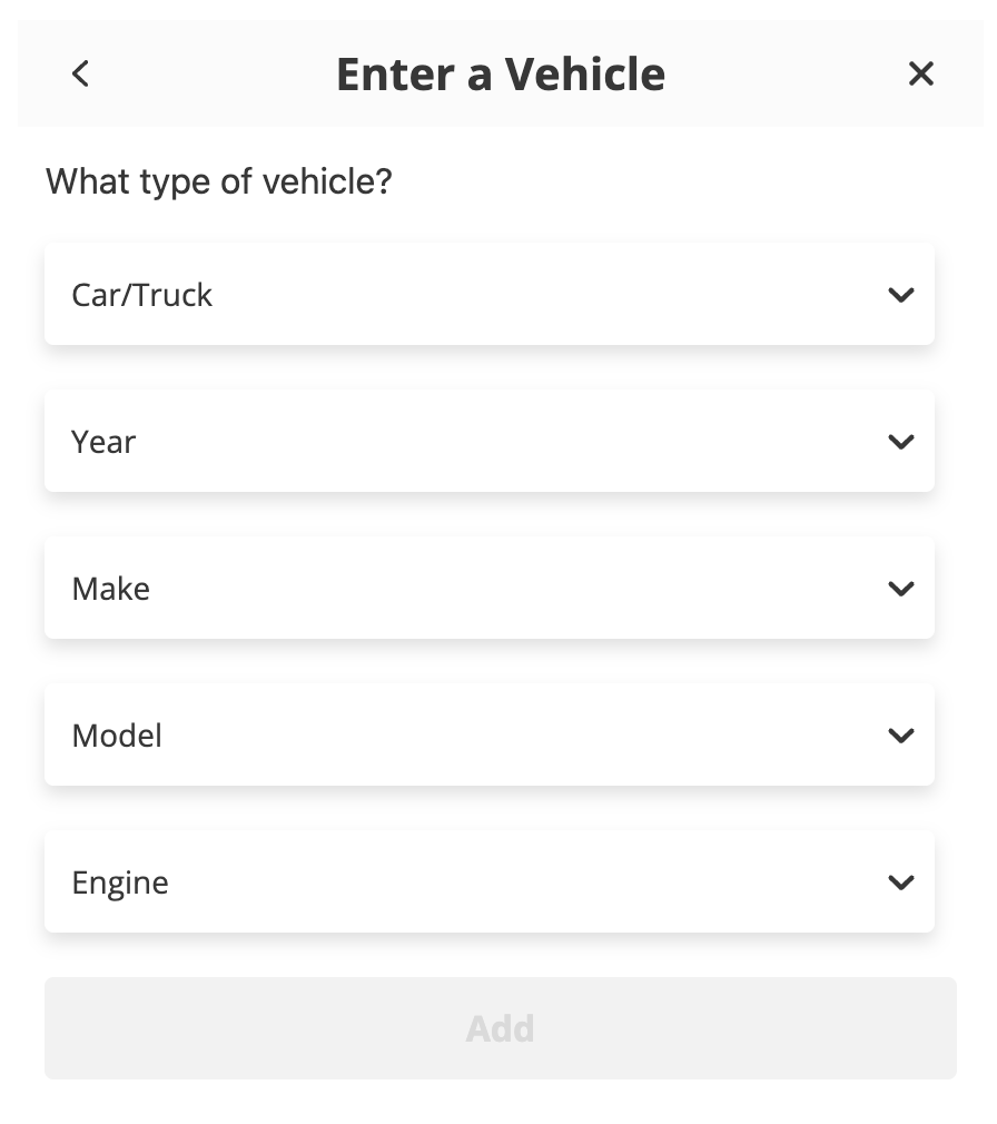
For this auto parts client, our team had identified that users who saved their vehicle information had a significantly higher conversion rate than those who did not - likely because having a saved vehicle allowed them to easily find relevant parts. Though there were a few methods for vehicle addition present on the site, none of them proactively engaged the user. Additionally, the existing methods all presented forms with 5+ fields visible at once, which can lead to user intimidation and fatigue.
As an A/B experiment, I proposed a simulated “chat-style” interface to encourage users to save their vehicle information. The experiment proactively engaged users when the landed on the site and led them through the vehicle addition form step-by-step, with encouragement along the way. Under the hood, the content in the interface was identical to the existing forms, but displaying one field at a time with conversational questions and a natural-feeling typing delay resulted in a radically different experience.
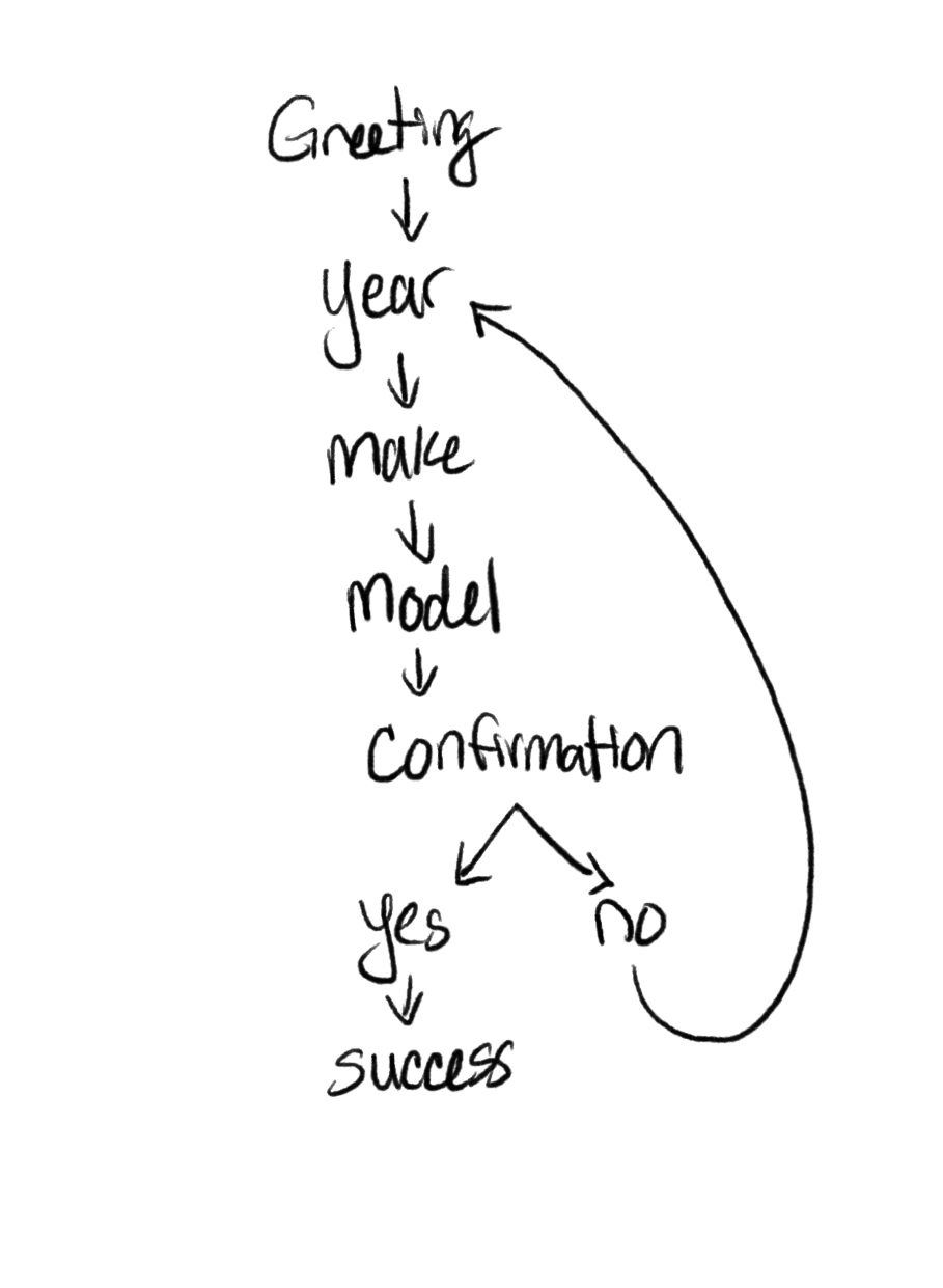
The chat-style vehicle addition interface led to a 30% increase in users who added a vehicle during their session - a hugely impactful lift. As had been hypothesized, this increase also led to statistically significant lifts in transactions and revenue per visitor metrics further down the funnel.