- Encourage users to discover and use a variety of apps
- Improve understanding of app purposes and increase access to documentation
- Create a professional, visually appealing interface to display to prospects and clients
The "Marketing Hub" at my previous company faced two parallel challenges: internal adoption and external presentation. Our team had created a growing set of internal tools, but they had been developed without emphasis on UX/UI design. As a result, employees often struggled to find and understand the tools they needed, and the Hub itself wasn't polished enough to present confidently in client-facing contexts.
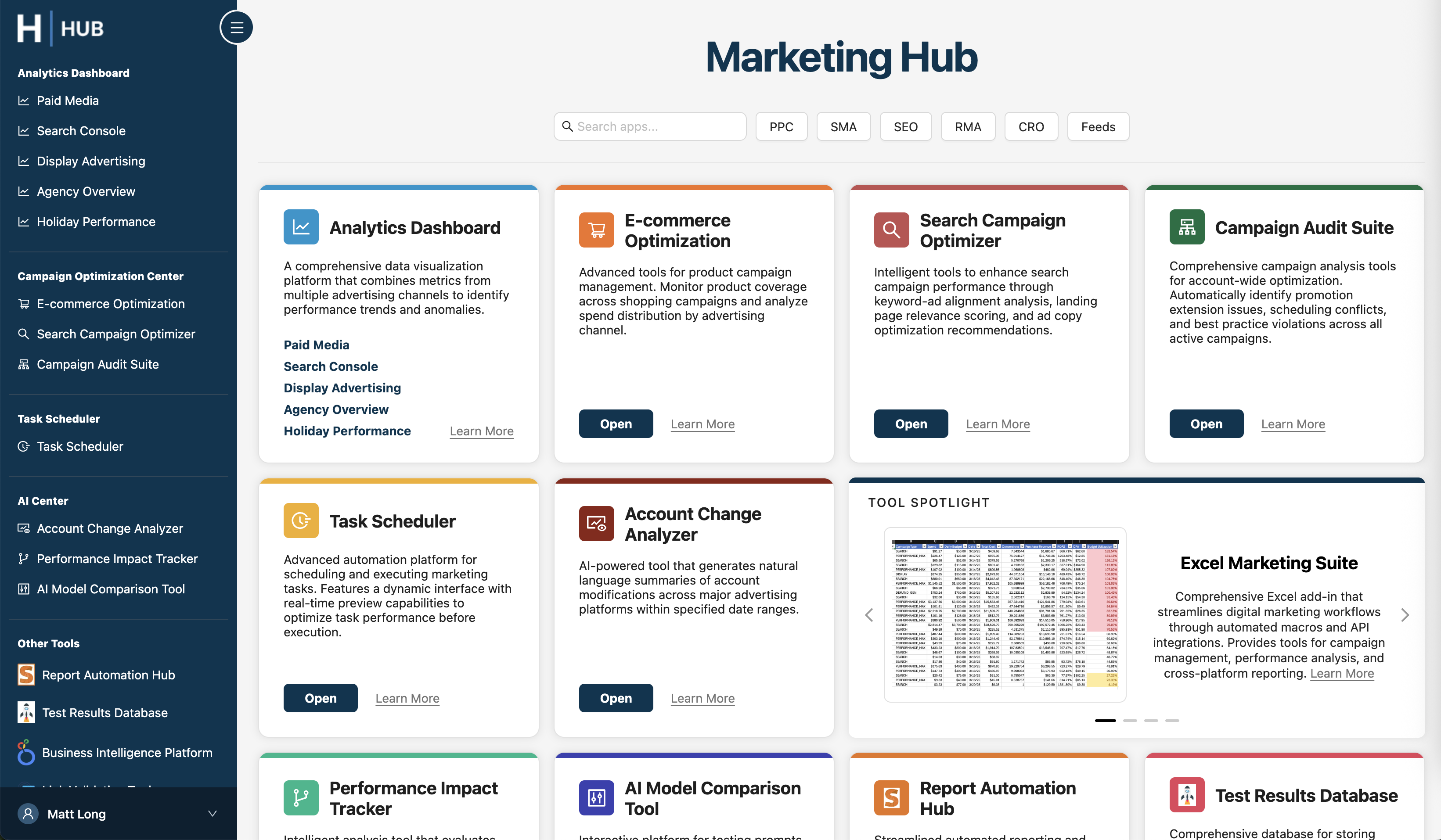
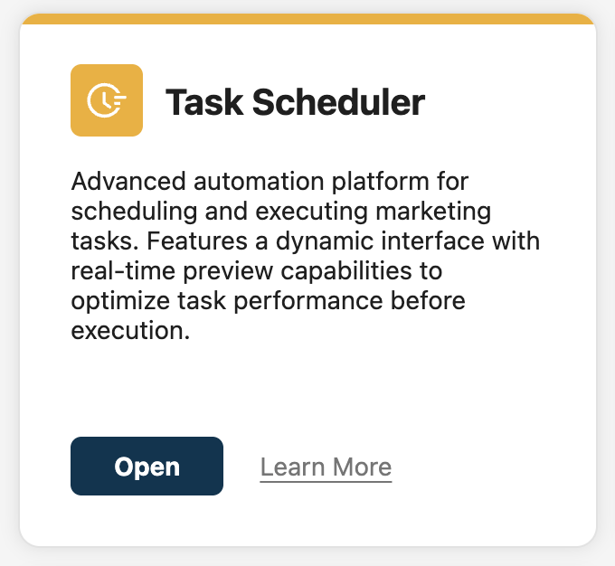
To address these problems, I interviewed several employees to evaluate their current usage and understanding of various tools. Based on those learnings, I redesigned the global navigation and homepage. By keeping the left navigation permanently expanded and adding a contrasting background color, users are encouraged to navigate between apps. I also used the homepage to provide context for the apps, creating a "card" for each app with its name, a brief description, links to documentation, and a call-to-action to open the app. These cards also provided the opportunity to feature a unique icon and color for each app, giving each a quasi-"brand" and allowing users to more easily orient themselves when inside an app.
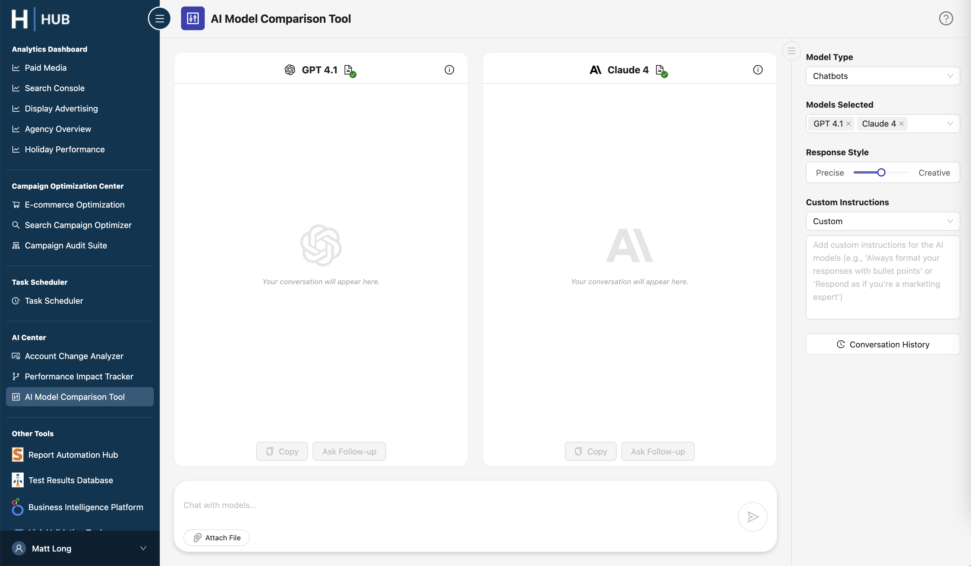
To increase consistency between individual apps, I designed universal components including a header bar which features the app's color, icon, name, and a link to documentation. I also surveyed employees on individual apps to uncover pain points and confusion which I resolved through targeted UI improvements.

The redesigned Marketing Hub created a clearer, more intuitive entry point into our internal tools. The expanded navigation and card-based homepage make it easier for employees to discover and adopt apps they may not have otherwise used, while consistent branding elements (icons, colors, headers) give each app a recognizable identity.
Beyond internal adoption, the polished visual design and universal components elevated the Hub into a client-ready product. Colleagues have already highlighted how the improved clarity and consistency make the platform not only easier to use, but also more impressive to present in strategy sessions and sales pitches.